Choropleth Map
Description:
This choropleth map depicts
the percentage of people per Wisconsin County who have identified themselves on
the U.S. census as “Native American & Alaska Natives”. I classified the
data by using the buckets portion of the “fill color polygons” section of the
feature styles. I gave it 5 classes. The classification method I used for this
was custom. Since it was a small range of percentages, I didn’t want to do any
of the classifications because they all made much of the map the lightest color
since the majority was .1-.2 percent. I customized it so that the classes would
be more evenly weighted. The pattern I found in the results of the merged
choropleth map (which was not a surprise at all) is that the highest percentage
of Native American population correlates with the counties where federally recognized
tribes reside (shown in figure 2 below). Specifically, the highest percentage being
Menominee county. Another pattern is that the .2 to .5 class is mostly surrounding
the higher classes. You can insinuate from that Native Americans, if not living
on the reservations, live in counties with closer proximity to the reservations.
A higher percentage also reside in the northern half of the state, which makes
sense since most of the tribe land is in the northern half.
 |
| Figure 1: Native American Population Per County in Wisconsin |
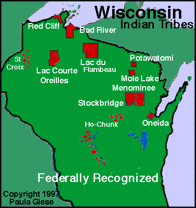 |
| Figure 2: Map of Tribes |
https://fusiontables.google.com/embedviz?q=select+col0%3E%3E1+from+1nuRdFHZ4qm_5t518Pis4Q2PR_gZvkOifX1DKElvG&viz=MAP&h=false&lat=44.721290665432264&lng=-87.46483619257822&t=1&z=7&l=col0%3E%3E1&y=2&tmplt=2&hml=KML


No comments:
Post a Comment