FINAL MAP!!! This was a really fun map to make because I did
it for my capstone research. It was also really cool because I got to know more
about the county I will be living in after graduation. For this final map I did
a reference map of all the year-round outdoor recreation in Fillmore County,
MN. The biggest challenge for me on this map was deciding what variables to put
in and which ones to leave out. I didn’t want to make the map so clustered, but
I also didn’t want to leave anything out. I think it ended up being the right amounts of elements. I could still spend hours making improvements on this map, but I think for the audience that I am trying to reach with this, being ages 7-18 for Eagle Bluff Environmental Learning Center, it is appropriate and easy to use.
UWEC-Cartography280
Monday, December 17, 2018
Tuesday, November 20, 2018
Exercise 7
Choropleth Map
Description:
This choropleth map depicts
the percentage of people per Wisconsin County who have identified themselves on
the U.S. census as “Native American & Alaska Natives”. I classified the
data by using the buckets portion of the “fill color polygons” section of the
feature styles. I gave it 5 classes. The classification method I used for this
was custom. Since it was a small range of percentages, I didn’t want to do any
of the classifications because they all made much of the map the lightest color
since the majority was .1-.2 percent. I customized it so that the classes would
be more evenly weighted. The pattern I found in the results of the merged
choropleth map (which was not a surprise at all) is that the highest percentage
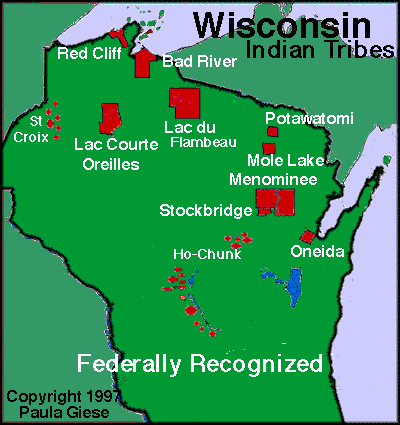
of Native American population correlates with the counties where federally recognized
tribes reside (shown in figure 2 below). Specifically, the highest percentage being
Menominee county. Another pattern is that the .2 to .5 class is mostly surrounding
the higher classes. You can insinuate from that Native Americans, if not living
on the reservations, live in counties with closer proximity to the reservations.
A higher percentage also reside in the northern half of the state, which makes
sense since most of the tribe land is in the northern half.
![]() |
| Figure 1: Native American Population Per County in Wisconsin |
![]() |
| Figure 2: Map of Tribes |
https://fusiontables.google.com/embedviz?q=select+col0%3E%3E1+from+1nuRdFHZ4qm_5t518Pis4Q2PR_gZvkOifX1DKElvG&viz=MAP&h=false&lat=44.721290665432264&lng=-87.46483619257822&t=1&z=7&l=col0%3E%3E1&y=2&tmplt=2&hml=KML
Friday, November 2, 2018
Exercise 6
Georeferenced PDF Map
I enjoyed the georeferenced map
process because we got to go out and kind of do some field work. My groupmate
Hunter and I decided to do a route you could take if you needed a break from
school or studying or digitizing😉. We did a walk that would feature the
Chippewa. The GPS process was simple we just followed the instructions given to
us, and it worked and then we uploaded the content onto the computer into
ArcMap’s and it worked. It was really cool because I had not done anything like
that before. We did it a bit in Ecuador, but Chase did the computer process of
it all. Then the biggest struggle was trying to incorporate cartographic skills
in ArcMap’s because it is hard to do aesthetically pleasing things in that. We
kept it pretty simple, and I think it looks good for what we could do.
Saturday, October 20, 2018
Exercise 5
Exercise 5:
I first of all enjoyed this
exercise and learned more about the counties of Wisconsin because I thought I
knew most of them, but it turns out I didn’t know as many as I thought. I’ll go
through the five design elements for this reference map again. For figure
ground, the main thing I focused on was how much to tone down the out of state
highway and roads. In Illustrator they weren’t very prevalent, but now I see
after I turned it in that they are too noticeable in PDF form. That is
something I will go back and change. For legibility, I think I could have made
the county labels a bit larger because now I am seeing they aren’t the easiest
to see along with the city names. I didn’t use anything under 8 fonts, but I
should have used larger font anyway. In terms of clarity my biggest challenge
was between the city and county names. I think I made the difference obvious
though. One thing I notice is that in the legend primary highways is hard to
see with the color I chose for the legend background. Another thing I did was
change the indigenous nations from just a stroke to a fill. I thought it was
hard to see them on the original map, and not they stand out more being filled
in. I wish the highways weren’t so overpowering on the PDF form of this map
because they didn’t look like that on Illustrator, so that is something I’d
change as well. For balance, again the biggest thing was where to put and how
big to make the title. I ended up putting it in the right corner because the
legend was on the left and it would have been too much on that side. I also
separated the legend into three separate ones because it just seemed to look
better and clearer that way. I think I should have made the north arrow and
scale larger now as well. For visual hierarchy, I decided to make the
population a big focus point along with the other elements in the legend.
Otherwise, I can’t really think of much else that caused any challenges. I feel
as though I keep improving with each map which is exciting. Looking back, I
would also change the lake labels so the Michigan one was vertical and the
superior one was spread out more.
Sunday, October 14, 2018
Exercise 3
Lake Map
Loon Lake is located in the boundary waters of Northern Minnesota. It is just a short canoe and portage away from the Canada border. Gunflint Lake, which is located in the top left portion of the map, is situated on the Minnesota-Canada border. There is a Loon Lake lodge located on the bottom right corner of the lake. This is where the influence for the maps title came from because it is the wood sign that welcomes you to the lodge.This lake is great for trout and pike fishing and is a beautiful place to kayak, canoe, or just spend a beautiful day on the lake. The closest big city to Loon Lake is Duluth which is about 150 miles away.
The lake was created from the Minnesota DNR websites contour map of Loon Lake we were provided with. The contour lines were digitized from the pdf version which was the most time-consuming part of this process because of how many there are. Loon Lake is quite deep and has a challenging shoreline. The background is brought in from google maps satellite images and the lake was just put over the top of the background.The lake is the focus of this map, so the rest of the elements are very simple. There is a more artistic legend of the contour lines, simple north arrow, label of Gunflint lake, and Loon Lake Lodge. There are no labels on the lake itself to keep the clarity of the lines.
Monday, October 1, 2018
Exercise 2
South American Reference Map
Exercise 2 entailed a use of
cartographic skills to enhance a reference map of South America. I will be
covering how I used the five design elements throughout this exercise. In terms
of figure-ground, the hardest decision to make was how dark or light to make
the Oceans. I went with a deeper because I thought it was more visual
appealing. Also, in Illustrator the latitude and longitude lines appeared a lot
lighter than they do when put into PDF format, so that was a challenge I wasn’t
expecting. For legibility, my first draft of the map was less legible. All
fonts were pretty small, and they were hard to tell apart. For my second draft
I went with different fonts and font sizes for it to be more legible. This also
goes along with the clarity of the map. I think I improved by changing the
colors of fonts to differentiate the elements like the rivers and mountain
regions that I didn’t have changed in the first draft. In terms of balance, I struggled with how big
to make the North Arrow because I don’t have much experience with cartography
at the time. I made it smaller in the second draft and made it align with north
on the longitude lines. Otherwise balance wasn’t too hard with this map. It was
just trying to decide how big to make the South America title. Lastly, for
visual hierarchy I didn’t change much because everything was pretty much in
place already. This wasn’t that difficult for this reference map I thought.
Otherwise I didn’t have very many problems with this map maybe because I had
just completed a reference map of Africa last semester for GEOG 200.
Subscribe to:
Posts (Atom)
Exercise 10
Final Map Project: FINAL MAP!!! This was a really fun map to make because I did it for my capstone re...